How to Do Color Analysis: A Practical Guide to Finding Your Best Colors
Most people start color analysis the same way: one selfie, one viral test, one season label they half-believe. That is why so many people end up with contradictory results.
One quiz says Soft Summer. A consultant on TikTok says Warm Spring. A friend insists you are obviously Autumn because gold jewelry looks nice on you. Then you try on a lipstick that should work for that season and somehow look more tired than before.
The trouble starts when color analysis gets reduced to naming a season. A useful analysis works more like a decision system. It helps you read four things more clearly: temperature, value range, chroma, and contrast. The season comes later as shorthand. If you chase the label first, you can end up with an answer that sounds tidy but does not help you shop, dress, or choose makeup any better.
Step 1: Stop treating undertone as the whole answer
If you only remember one thing from this article, let it be this: undertone matters, but it only answers part of the question.
Many first-time guides oversimplify the topic. They explain warm versus cool, maybe mention neutral, and then jump straight to seasons. That gets you started, but it leaves out the other variables that make two people with similar undertones look best in very different palettes.
A full analysis looks at four dimensions:
| Dimension | What it means | What it changes in real life |
|---|---|---|
| Temperature | Warm, cool, or balanced color direction | Whether camel, coral, tomato red, icy pink, cobalt, or blue-red look more harmonious |
| Value | How light or deep your best colors are | Whether pale pastels flatter you or wash you out, and whether very dark shades sharpen or overpower you |
| Chroma | How clear or muted your best colors are | Whether dusty shades refine you or make you look dull, and whether vivid shades brighten you or take over your face |
| Contrast | How much separation your features can carry | Whether black-and-white looks crisp or harsh, and whether low-contrast outfits look elegant or sleepy |
This is why 12-season and 16-season systems exist in the first place. The original 4 seasons mostly sort by broad temperature and overall feel. The more detailed systems try to account for value and chroma with more precision.
If you have been trying to solve everything with the vein test, the jewelry test, or one foundation mismatch, those shortcuts are only giving you part of the model.
Step 2: Know whether you need 4, 12, or 16 seasons
One reason color analysis can feel confusing online is that people often talk about different systems as if they were interchangeable. They are related, but each one answers the question at a different level of detail.
Some analysts moved to 16-season systems to add even more nuance for people who sit awkwardly between neighboring categories.
That extra detail only helps when you actually need it.
Here is a practical way to think about the three systems:
| System | Best for | Limitation |
|---|---|---|
| 4 seasons | Fast orientation and broad direction | Too coarse for many real wardrobes |
| 12 seasons | Most people who want a usable, stable palette | Still forces some borderline cases into the nearest box |
| 16 seasons | People who consistently land between two adjacent seasons | More nuance, but also more system variation and more room for overthinking |
There is not just one official 16-season layout. Different analysts use different bridge seasons and different naming conventions. So if one 16-season chart calls you Deep Summer and another gives you Soft Winter, that does not always mean one of them is wrong. It may simply mean you sit in the overlap zone they are both trying to describe.
A practical rule:
- Use 4 seasons to get a broad direction.
- Use 12 seasons to build a wearable wardrobe.
- Reach for 16 seasons only if 12 still feels half-right rather than clearly right.
If your 12-season result already helps you choose tops, lipstick, metals, and hair direction with less friction, you do not win a prize for making the system more complicated.
Step 3: Set up your at-home test so the result means something
Many tutorials rush through setup, but setup shapes the result. A lot of wrong analyses start with unstable lighting, screen settings, or photo conditions.
Apple documents that True Tone changes the color and intensity of compatible displays based on ambient light, and Night Shift warms the screen on purpose. Adobe's white-balance guide explains the same problem from the camera side: warm bulbs can push images yellow or orange, fluorescent light can skew green, and white balance affects all the colors in a photo, not just white objects. A PubMed-indexed study has also shown that white balancing photographs with a gray reference card changes recorded color values in a meaningful way.
In practice, your phone, camera, and screen can all shift the colors you think you are evaluating.
If you want a self-analysis that is worth trusting, use this setup:
- Face a window in bright indirect daylight.
- Avoid direct sun, overhead warm bulbs, car interiors, and mixed lighting.
- Turn off beauty filters, portrait enhancements, and auto-retouch settings.
- If you are comparing photos on an Apple device, turn off True Tone and Night Shift first.
- Wear a neutral top if possible and pull your hair away from your face.
- Use little or no makeup, and skip self-tanner if you can.
- Take photos from the same distance, angle, and expression.
- If you want one simple upgrade, hold a true white sheet of paper or a gray card near your face for one reference shot.
That is also why experienced remote analysts give detailed photo instructions: they are trying to keep the input conditions stable before the analysis even begins.
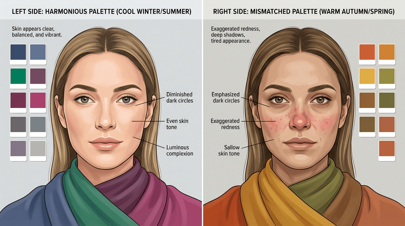
Step 4: Drape in controlled pairs, not random favorites
The next big mistake is comparing colors that change the wrong variables all at once.
People often compare black to beige, neon coral to dusty mauve, or creamy ivory to optic white, then treat the winner as a verdict on their whole palette. A comparison like that mixes temperature, value, and chroma, so it tells you less than it seems.
A better method is to compare controlled pairs:
- Warm versus cool at a similar depth and saturation. Think tomato red versus blue-red, peach versus cool pink, camel versus cool taupe.
- Clear versus muted at a similar temperature. Think bright teal versus softened teal, or clear coral versus dusty salmon.
- Light versus deep at a similar temperature and chroma. Think icy blue versus marine blue, or pale sage versus forest green.
- Lower versus higher outfit contrast. Think charcoal with soft navy versus black with bright white.
What matters is what the color does to your face, not which shade you happen to like more on its own.
Good drapes usually make some combination of these things happen:
- the skin looks clearer and more even
- under-eye shadows look less obvious
- redness or sallowness stops getting amplified
- the jawline and mouth look better defined
- the eyes look brighter after the skin looks better, not instead of it
Pay extra attention to that last point.
Research on skin color and facial perception has found that more even melanin and haemoglobin distribution is associated with faces being judged healthier and more attractive. Another study found that hair color and skin color interact in how faces are perceived. That does not mean a journal article can tell you your season. It does support something experienced drapers already know: judge the whole face, not just whether one shade makes your eyes pop or your dyed hair suddenly looks dramatic.
Step 5: Read the result as a pattern, not a verdict
Once you have done a few controlled comparisons, a pattern usually starts to emerge.
This is where many people force a dramatic answer too early.
If your best colors keep clustering around the same temperature and chroma, trust that first. If value is slightly less obvious, that is fine. If you seem to live between two neighboring seasons, that is information too.
A few common patterns:
- If cool, medium-to-deep, and slightly softened colors keep winning, you may sit somewhere between Summer and Winter.
- If warm, light, and clear colors brighten you most consistently, Spring is a stronger direction than Autumn.
- If warm, deep, and muted shades look rich while bright colors feel noisy, Autumn is probably doing more work for you than Spring.
- If cool, crisp, high-contrast colors clean up the face quickly, Winter is likely more relevant than Summer.
This is also where certain people get tripped up more often:
- Olive complexions can look warm in one test and cool in another.
- Dyed hair can fake a higher or lower contrast level than your face naturally has.
- Facial redness can make people assume they are cool when the underlying palette question is more complicated.
- A strong tan can change the surface read without changing the most useful long-term color direction.
If that sounds familiar, do not panic and do not rush into a hyper-specific label. A working answer like "neutral-cool, medium depth, softened color" is often more useful than a season name you do not quite trust yet.
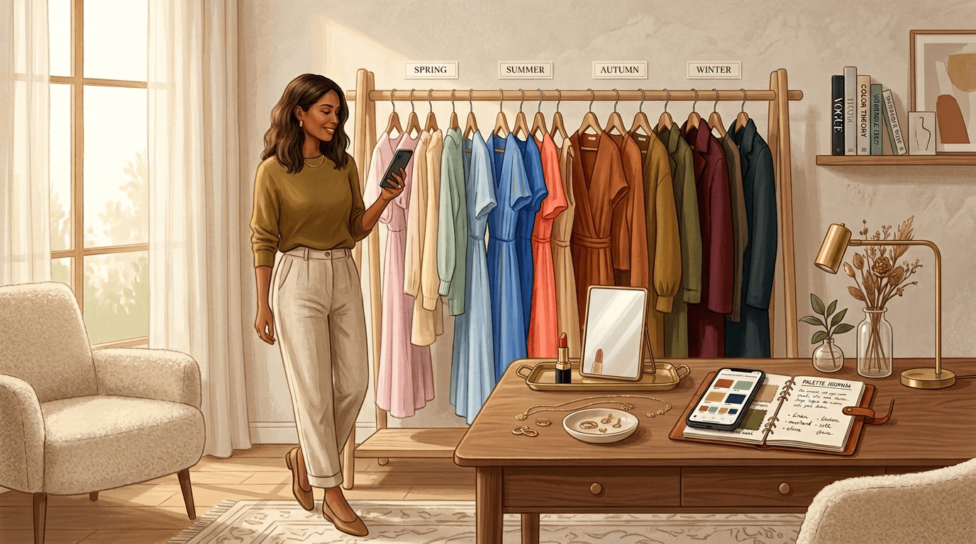
Step 6: Build a palette you can actually wear
This is where color analysis starts paying off in real life.
A lot of people get typed, download a palette, admire it for a day, and then go right back to buying the same almost-right items as before. The useful move is to turn the result into a small working palette.
Start with this:
- 3 anchor neutrals you can wear constantly
- 5 to 8 core colors that make your face look reliably better
- 2 accent colors for accessories, knitwear, or lipstick
- 1 metal direction that feels easiest near your face
That is enough to improve most wardrobes without a dramatic purge.
For example:
- A soft, neutral-cool person might start with navy, mushroom, soft charcoal, rose, dusty teal, berry, and pewter.
- A warm, clear person might start with cream, camel, warm navy, coral, leaf green, turquoise, tomato red, and gold.
- A deep, muted person might build around espresso, olive, aubergine, forest, deep petrol, brick, and antique gold.
Two more practical rules:
First, black and white are not universal neutrals. They function more like a contrast choice. Some people look incredibly sharp in them. Others look cleaner in charcoal, ink, cream, cocoa, or stone.
Second, do not rebuild your wardrobe from the hardest categories first. Start with tops, scarves, lipstick, blush, and earrings, because those sit closest to the face. Trousers and shoes matter less to the read.
Digital tools are useful here when you treat them as comparison aids rather than final judgment. A good online workflow lets you test families of color, notice repeat patterns, and narrow the field before you spend money on makeup, hair, or a closet overhaul.
Step 7: Know when online analysis is enough and when to book a pro
Online color analysis works best as a comparison tool, not as a replacement for every other method.
Online analysis is strong when you want:
- a fast first direction
- side-by-side palette testing
- a digital reference while shopping
- a lower-risk starting point before bigger decisions
In-person draping is still worth it when:
- you keep landing between two seasons
- you are about to change your hair color dramatically
- you are rebuilding a large wardrobe
- your skin is difficult to read from photos
- you want the reasoning as much as the result
Online tools are efficient and easy to revisit. In-person draping gives you tighter control over lighting, fabric, and live feedback.
If you use online analysis as a comparison tool instead of a magic oracle, it becomes much more valuable.
A useful result beats a perfect label
Color analysis usually feels confusing when advice turns a complicated visual question into a quick label. A better process is straightforward:
- Get a stable setup.
- Compare controlled drapes.
- Look for repeat patterns in temperature, value, chroma, and contrast.
- Use the season as shorthand, not as the science itself.
- Build a small wearable palette before you chase total certainty.
That process is slower than a quiz result, but it gives you something you can actually use. The point is to look more alive in your clothes, shop with less friction, and stop wasting money on colors that looked good in theory and wrong on your face.